
The year of 2020 ended with a string of stories about publishing and the broad publishing community that highlighted ongoing failures and systemic fractures. These stories included Poets House, a Manhattan poetry library hosting events to support engagement and conversation around poetry, laying off a majority of its staff; Penguin Random House purchasing Simon & Schuster, turning the Big 5 (along with Hachette, HarperCollins, Macmillan) into the Big 4 — with approximately 60% of English-language books coming through ever fewer number of publishers; New York Times published an opinion piece on racial inequities in publishing, highlighting the eye-catching detail that only “5% of fiction published since 1950 was written by people of color” and the deeper bias it signifies; and an anonymous letter from a former Small Press Distribution employee citing patterns of financial abuse and mistreatment (leading the distributor to recently hire “Oppenheimer Investigations Group to conduct an objective assessment of our workplace, employee concerns, and our culture, and to provide recommendations on addressing these issues and improving our work environment.” All of these are signs of a field in need of self reflection for the betterment of all associated with the field from writers and readers to editors and graphic designers.
And yet, it is not all doom and gloom. The passionate work of literature continues. Meytal Radzinski has dedicated 2021 to the recognition and celebration of women writers in translation, posting daily under #DailyWIT on Twitter, and Open Letter’s Chad Post is doing a deep dive into the Dalkey Archive and exploring the history of the Best Translated Book Award.
All return me to a question close to the heart of HAUS RED: what is the role of the publisher? Or more exactly, not how does a publisher makes texts available to a public, but how do they create and craft spaces for their texts, and what models do they employ to create more equitable, rewarding, exuberant spheres for art?
—Nicholas Grosso
New York
March 2021

PUBLISHER: ORNAN ORTEM
In addition to being the publisher of Sylph Editions, Ornan Rotem is the translator and designer of Days Bygone. In response to my prompts and questions, Ornan composed the following and generously included addenda related to the translation of Days Bygone and the broader Sylph Editions publishing program.
SYLPH EDITIONS came about accidentally-on-purpose. ‘Accidentally’ in the sense that there was no programme, no plan – business or other – that it was circumstantial perhaps even serendipitous. It was purposeful in the sense that there were genuine intentions, there was a will, an overarching idea and the knowledge to execute it.
Our first book, Ten Poems from Hafez by Jila Peacock, perfectly captures this. Jila is a painter of British and Iranian descent and in 2005 she produced an artist’s book of poems she had translated from the Persian and which she had rendered into zoomorphic drawings. She printed her book at the Glasgow Print studio in an edition of 50 but she was also keen to publish the book as an affordable commercial edition and asked me to design it. She approached several publishers but was taken aback by their insensitive responses. Her encounters with prospective publishers revealed that the prevailing attitude was, something that I too had seen from my perspective as a book designer. Publishers lacking an understanding of what a book is and a failure to imagine what it can be: ‘14th century Persian poet? Too obscure. Love? Don’t really get it – and what’s the market? OK, maybe a small paperback, short run, that you finance.’ After she failed to find a suitable publisher we decided to plunge in and do it our way and to spare no effort in doing it. It would be a slim book, beautiful and will handle ‘obscure’ poetry differently. It was a perfect springboard since it was word and image, two places where I felt very much at home. It was art and literature intricately bound into each other and it set the tone for all future publications. It made use of the extensive experience we had as a design studio working mostly with books. It was to be beautiful and original and produced in a way that could cover its expenses. Our ignorance on the more prosaic side of publishing was counterpoised by serendipity: Jila’s original artist book was to be exhibited as part of the Word into Art exhibition at the British Museum and the museum bookshop happily took on board our publication and offered us unprecedented exposure and fortuitous sales.
Ten Poems exemplified Sylph’s approach. First, books where text and image are conceived as one; that is to say that the one is not subordinate to other, that they engage with each other in a meaningful dialogue. This is the opposite of illustrated books in which primacy is given to the text and the images, regardless of their merit, are ancillary. Admittedly, we began on a high note since in Ten Poems the image is the text and the text is the image and to a certain degree nearly every publication to date embraces this aspiration. Not only this, but other core values that can be summed up thus: respect and admiration for the book as a physical object, complete and total involvement in all stages of the making and dissemination of the book, and the primacy of content. I shall explain in greater details what I mean by these values and then demonstrate this by a few chosen examples.
THE PHYSICAL BOOK. The proliferation of digital culture has offered great opportunities for books of a certain kind. The glass screen is a great equalizer; it irons out differences and places all content in a Procrustean bed. The delivering device (screen, tablet, phone) dictate predetermined sizes, locking the reader into a material universe with relatively little variance (glass) and limited sensory interaction (mostly eyes and ears). In return for these limitations you get unprecedented delivery speeds, open-ended updates and opportunities for enhancement, such as sound and moving images. Where this is meaningful, for example in an educational text book or an encyclopaedia, the codex is at a disadvantage and will probably be relegated to the periphery of the publishing world. But where material qualities and size can make a difference, where the room for touch and smell can be meaningful, where there is pleasure in relishing in someone else’s artistic decisions, the book will thrive. To put it bluntly the ugly book is dead, it is the time of the beautiful book. Now is the time for books where typography is not left to the whim of the reader (aptly named the ‘user’); for books where paper is well chosen and relates to content; for books that create a luxurious and pleasurable sensation and work through the fingers and nose and ears as much as the eyes; for books where the mere presence of the object in its uniqueness and disconnectedness is a source of pleasure and delight. And the more online culture makes everything look the same, the more we will find the yearning for a different and more sensual kind of experience. The cheaply-printed yellowing paperback served a purpose, an important purpose, but its time is over and it is important that publishers and book designers embrace a new set of skills and look at things differently. With Sylph Editions, we are trying to work within this new framework.
TOTAL INVOLVEMENT. In the early centuries of book production, that is the 17th century, most aspects of the making of books happened under one roof. Over the years, the different function became more specialized and with industrialization layout, printing, publishing and distribution gradually became independent activities. What we are doing harks back to the old days; it is a cottage industry with a twist and the 21st century is ideally placed for this model. On the whole, when we publish, we engage directly with the author. We try not to work through intermediaries such as agents and gladly embrace our primary role as readers. We keep editorial in house and where feasible, translation too. Should the need arise, for example, in introductions to art books, we will endeavour also to write it ourselves (see for example the introduction to Saul Leiter’s Painted Nudes). We handle all assigned photography since we have a high end photographic practice. Design is done in house and we find the prevailing custom idea of passing on covers to a third party abhorrent. A book is designed from its centre, which springs from its content, and the cover needs to grow organically from the text section. Production is all handled in house and we engage directly with our printers and are always on press when a book is printed. Yes, we do have a distributor but at the same time, these days online sales, much like the bookshops of yore, is an important aspect of publishing. That means we also pack and wrap and go to the local post office. In that sense we are traditional and at the same time modern not only in working and embracing the most up-to-date technology but in making use of what a connected culture offers.
PRIMACY OF CONTENT. As I hinted before, it is my understanding that for the kind of books we design, to be a book designer is first and foremost to be a reader; it is a certain kind of commitment to the printed word. I think the same applies to what we expect of publishing. To achieve this we find it necessary to create ad hoc partnerships that complement our skills and interests. These partnerships enable us to enrich our context and to execute our productions since they also have financial value. Partnerships need to be based on trust, shared values and mutual benefit. Of course, this can change overtime. Sometimes these partnerships are with individuals, sometimes with institutions. For example, we teamed up with Piano Nobile, a London art gallery, to create The Nobile Folios, a set of six publications that explored a single work of art visually and textually. Each short publication chose one prominent artwork that was in the gallery’s inventory and we reproduced each work in it’s totality and carefully well chosen detail shots. To complement that, an author was assigned to devise an original piece of writing inspired by that work. Another example is our collaboration with the American University of Paris producing The Cahiers Series. There are currently 36 volumes in this series whose general remit is to make available new explorations in writing, in translating, and in the areas linking these two activities. Translation is understood in the broadest sense possible not just movement between language but also translations as shifting between cultural practices e.g. painting architecture music, etc. And of course, since it is conceived under the aegis of Sylph Editions, each publication is a dialogue with carefully chosen images.
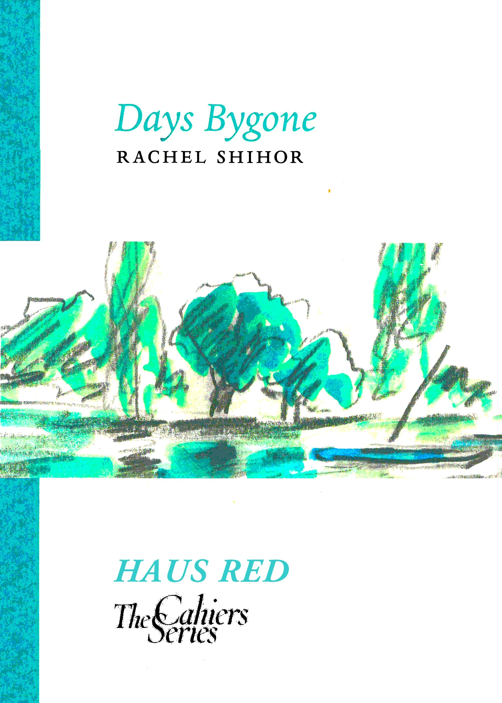
Two examples will convey how these values are put into practice. Rachel Shihor’s Days Bygone is the seventh volume of The Cahiers Series and was published in 2008. Rachel Shihor is a contemporary Israeli writer. Her writing stands apart from most of her peer’s literature both in content and her use of language. I’d read her novel, Ha-Tel Avivim, in the original, and it left an indelible impression on me. This was her only published book but it is the sort of book that when you finish it, your first response is simply to want more. I approached her, primarily for egotistical reasons; I asked if I could read more of her work. She sent me an unpublished novella called Yankinton which I found exquisite. I gathered that it had yet to be published in Israel and not only that, it was having a difficult time getting a publisher. The question is always why? and the answer is, I don’t really know. Some of it was down to luck (bad luck), some due to mismanagement and some of it, I suspect was the consequence of swimming against the current. It was then that we thought that The Cahiers Series, with its’ emphasis on translation, would be an ideal vehicle to promote this author and an opportunity to exercise the Series’s remit by contextualizing texts for the non-native reader. I had in the past translated from the Hebrew, and so I did not hesitate to take this upon myself. Being the publisher, translator and designer tied in with our notion of an all-in-one cottage industry publishing. Each cahier is limited to 40 pages, so it meant choosing excerpts, which I did with the author. We then had two of our previous writers go over the translation (Richard Pevear and Lydia Davies) who made their comments – as you can see, it all stays ‘in house’. Shihor has a language of her own, and it was quite a challenge and given the framework of The Cahiers Series it made sense to explain, discuss and elaborate some of the issues arising from the translation in an afterword (see addendum 2). Because the novel is set in Tel Aviv in the late 50s there seemed no better way to engage with the material than through the material of David Hendler, a contemporaneous, down trodden artist of the period. I knew his paintings very well as my parents owned several of his watercolours (in house again) and we approached his daughter in order to seek out more of his work. We met with her at her place and sieved through endless folders and after making our choice, we scanned and cleaned the selection in our design studio. Since Hendler’s work was counterpoised to Shihor’s writing it made sense that the translator offer the reader some background on him and thus we ended up with yet another afterword. The cahier was very well received; people were intrigued and wrote from near and far asking about Shihor, always wanting to know more. This promoted us to publish a second book with Sylph called, Stalin is Dead, with an foreword by Nicole Krauss, one of those aforementioned intrigued readers. In time Shihor has had her work published by Seagull Books, and I’d like to think that this is a direct outcome of the cahier she published with us.
The other example I’d like to offer is the photographic essay A Typographic Abecedarium, maybe because it sits at the other end of the continuum of our publishing ethos, but still very much part of it. I have also chosen this example since being it’s author it is relatively easy for me to talk about it. It assembles different strands of my professional interests: writing, typography and photography. The book explores the relation-ship between typo-graphy and the visual world. The premise is very simple: each letter of the English version of the Roman alphabet is refracted, appearing in four dimensions: as the world presenting itself in the shape of a letter; as an intended letter in space; as a flat letter on paper, and finally in the manner of a pure geometric form embodied in a typeface. This publication was years in the making. Primarily, it meant going around with a camera in London, Paris, Berlin, New York – wherever I went – plucking typographic examples that convey the idea underlying this book. The next phase was more studio bound since it drew from two-dimensional sources. In what respect is it at the other extreme of Days Bygone? It is a solitary work, much less about collaboration, and also much more private, contemplative and idiosyncratic. But it is equally part of our publishing ethos since it attempts to create a book whose validity is derived from the specificity and uniqueness of the printed page. To stress my point, let me state that besides the codex, inside the book is a larger double-sided poster of the whole abecedarium section. It is also part of the ethos because it all happens ‘under one roof’ and, finally, it is an attempt to engage and articulate the textural with the visual in ways not dissimilar to Jila’s Ten Poems from Hafez: it is about letters, that in turn make up words, sentences, paragraphs, books. It is also textual in the more mundane sense that besides an introduction each of the chosen dimensions of a letter are explained.
ADDENDA
01 THE EXPLANATORY AFTERWORD, REPRINTED IN EACH OF THE NOBILE FOLIOS
One of the primary gestures in the appreciation of large canvases is the act of moving in closer in order to apprehend the details and to immerse oneself in the painting. Not every work lends itself to this kind of investigation, but when it does, curbing one’s view seems to unleash new paintings, variations on the grand theme of the canvas as a whole. The whole is nothing but the sum of these refracted parts, though admittedly a sum larger than its parts. Each spread in The Nobile Folios is an attempt to identify and to explore these parts, these auxiliary paintings. This exercise has an added benefit. Most of the canvases in the series are much larger than even the largest of books; the fragmented view releases the painting from the Procrustean constraints of the printed page, drawing us nearer to a real-life appreciation of the painting.
Words are an inseparable part of our experience of a painting. Verbal expression can take many different forms: a learned discourse, an entertaining anecdote, a touching recollection, or merely an association. The juxtaposed texts that form part of The Nobile Folios are precisely the latter: informative associations. They represent words that might come to mind when one gazes at the painting. The association, obvious or oblique, complements our attempt to explore the painting and enhances our appreciation of it.
02 REMARKS ON THE TRANSLATION (AFTERWORD IN DAYS BYGONE)
Any reader of Rachel Shihor’s original text will not fail to be struck by her unique language and its precise application in her prose. Hers is a language of opposites. On the one hand, rich in historical and literary allusions, while on the other, a very personal, almost idiosyncratic, language. Her sentences alternate between the straightforwardly simple and the excruciatingly complex: a short, seemingly childlike sentence befitting the protagonist’s age, may be followed by an intricate multi-layered construction, a testimony to the author’s philosophical training. Equally noticeable is the musicality of her Hebrew: ancient words or word formations will be inflected in modern idiom, or ‘played’ in a contemporary, dissonant key. Hannah Herzig, writing about Ha-Tel Avivim, rightly notes that ‘the melodiousness of [Shihor’s] Hebrew echoes previous epochs, even though the words she chooses are not in themselves ostentatiously archaic’. Another aspect of this musicality makes itself heard in a tension between what is said and what is left unsaid. At times it seems that she uses language to conceal as much as to reveal.
Modern Hebrew readily draws on a linguistic practice and on an elaborate literature that spans some two and a half millennia. Even a simple sentence in Modern Hebrew bears immediate testimony to the different epochs that have converged in this language. One of the more prominent myths about Hebrew is that it was a dead language, which in the nineteenth century was revived alongside the regeneration of the Jewish people as a national entity. The political agenda underlying the promulgation of this myth need not concern us here, but it is important to note that throughout its long history Hebrew has always displayed an unwavering commitment to its past. It evolved not by obliterating preceding layers, but rather by assimilating them into the fabric of the language. In simple terms, this means that a very young speaker of Modern Hebrew can comfortably understand the less complicated sections of the Bible, a literature that dates back two and a half millennia ( by comparison, the same cannot be said of Homer and speakers of Modern Greek, the Vedas and speakers of Hindi, or Chaucer and English-speakers ). It might be argued that one of the unique developments of the last few decades in Hebrew literature and language is that for the first time one can detect a relaxation of this commitment. In this respect, Rachel Shihor’s writings are different. Hannah Herzig, again on Ha-Tel Avivim, evokes the subtle, yet important, distinction between ‘Israeli literature’ and the more dated term ‘ Hebrew literature’. Both are written in Hebrew, yet Israeli literature (a body of work measured in decades) pertains to the experience of a people in a well-defined geographical area; while the great arc of Hebrew literature (measured in millennia) pertains to a much broader cultural phenomenon reaching far beyond geographical confines. Herzig claims that Shihor’s work reads not like Israeli, but like Hebrew literature, and suggests aligning it with the work of such writers as S.Y. Agnon, David Fogel, and Amalia Kahana-Carmon – to whom one could add Ya’akov Shabtai.
This context has to be borne in mind, for without it, it may be hard to discern certain features of Shihor’s writing, features which are inevitably somewhat blurred, or even lost, in translation – as some examples may serve to illustrate.
03 ‘A WORD FROM THE PUBLISHER’ (FROM THE 2016 CATALOGUE)
A decade ago we published our first book: Jila Peacock’s Ten Poems from Hafez, a slim volume of zoomorphic poems in calligraphic form presented alongside the Persian source and accompanied by original translations of Hafez by Jila Peacock. In many respects, this book epitomized our ethos as publishers and continues to guide us to this very day: to let words and images coalesce on the printed page such that they become one. Subsequent publications have striven to attain this evocative interplay between the visual and the verbal in which each element is illuminated in a new and engaging way.
We are committed to making beautiful books, and books that celebrate both the image and the written word. The books we publish cover a wide range of subject matter and come in many different guises: from the slender volumes of The Cahiers Series to Rasika’s lavish large-scale art books. Nine years after the publication of Translating Music, our first cahier, and 29 issues later, The Cahiers Series remains as popular as ever. In this catalogue we are pleased to introduce three new additions by Kirsty Gunn, Javier Marías and Georgi Gospodinov, from New Zealand, Spain and Bulgaria respectively. Even in this small sample, the breadth and scope of the series is evident: three languages (two translations), three explorations of the art of translation from three unique literary voices.
Five years ago we founded Rasika, an imprint whose goal is to investigate and examine aesthetic culture in all its manifestations. These lush books have so far dwelt mainly on Chinese art and artisanship, but plans are underway to venture further afield: to India, Africa and of course, the West. In this catalogue, we are announcing two new Rasika titles. The first, Crags and Ravines Make a Marvellous View, continues our exploration of classical Chinese culture through an extraordinary scroll painting by the 17th century master Wu Bin. The scroll, one of the most esteemed and highly-prized examples from the Ming dynasty, depicts in utmost detail and with astounding candour ten views of a single scholar’s rock. Each view is bracketed by flowing vertical lines of calligraphy, written by Mi Wanzhong, the owner of the depicted rock who commissioned the scroll from Wu Bin. Our publication can be seen as a continuation of the subtle, suggestive act of annotating Wu Bin’s painting; like Mi and the authors of the ten colophons attached to the scroll, we cannot resist nestling images in a bed of words. Our book, forthcoming next spring, also attempts to recreate the experience of viewing and handling the magnificent scroll; in addition to a stand alone book, we are producing a handsome boxed limited edition featuring a folio of large-scale reproductions of all ten views printed on exquisite Takeo paper from Japan.
The second new Rasika title, Classical Chinese Furniture from Weiyang, is the work of the contemporary artist, scholar and restorer Zhang Jinhua, and provides a penetrating and imaginative study of the overlooked Weiyang style of furniture.
Our books, especially those not reined in by series such as the Cahiers or The Art Monographs, roam far and wide. They range from novellas to essays on typography, from poetry to photography books. Here, too, we are pleased to introduce a new offering. Gorgeous is a new volume of poetry by Robert James Berry. The poems are a collection of scintillating gems strung together to portray the story of a tumultuous and glowing love affair. Their nuanced colours – shades of vermilion, hues of gold and sapphire – have gently trickled down to C. Sabarsky’s specially commissioned images for the book.
Finally, let us return to the theme of making beautiful books. What unites our books is more than subject matter or form; it is their common quest for verbal and visual eloquence. It is a tireless quest and it is not always easy; at times, a wonderful text will resist the company of images, and conversely there are striking images for which a suitable text has not been written – and may never be. At other times, however, a collection of words and a body of images find themselves comfortably nestled in each other. Like the warp and weft of textile they make an inseparable, meaningful whole. We’ve mentioned Ten Poems from Hafez, yet among our more recent publications Lisa Davidson and Ralph Petty’s Breathing Underwater perfectly exemplifies this. Davidson’s poetry and Petty’s watercolours were conceived together and made in response to each other, but each, to begin with, was on its own. Once they were creatively forged together on the printed page, meaning shifted from each disparate element – image and text – and a new entity came into being.
Another way of looking at this is to say that striving to make books in such a manner is tantamount to dropping conventional boundaries which in turn give rise to new form. Our recently published Painted Nudes by Saul Leiter pushes the boundaries that he himself demolished. The works are marvels in their own right; neither pure photography nor pure painting, they are the best of both. By using his black and white prints as canvases Leiter gave new meaning to the images he had created. Then, in book form, when these images were punctuated by the apposite texts, the result was neither a photobook, nor an artbook, but something much more, something unique: a genuine Sylph publication.

AUTHOR: RACHEL SHIHOR
Rachel Shihor is the author of Days Bygone and Stalin is Dead from Sylph Editions, and Days of Peace and Yankinton from Seagull Books. In a first for HAUS RED, the interview was conducted by phone. The following is a transcript of our conversation, lightly edited for clarity while attempting to remain true to the conversation with all of its mishearings and strivings for clarity
Nicholas Grosso [NG]: I was first introduced to your work through Sylph Editions and Ornan Rotem’s translation of excerpts from Yankinton, Days Bygone. Would you mind sharing your experience working with Ornan and publishing with Sylph Editions?
Rachel Shihor [RS]: Ornan Rotem — yes, he is a very intelligent person. He used to teach philosophy at Tel Aviv University for a few years and then he settled in England. He has a specialty as a writer also, sort of philosopher, a person who knows how to think and how to develop ideas. And he is cooperating with his wife, Num. He is the sort of somebody who is a perfectionist, everything until the last last last drop of perfection, if it’s possible. What can I tell you more? Both of them helped me a lot in the beginning with publishing.
NG: He published and translated your first work into English?
RS: Yes, but now the last book, Yankinton, [from Seagull] is translated by two women [Sara Tropper and Esther Frumkin] who live in Israel. They live in Israel, and yes, Seagull is from India. And the man who introduced me to Seagull is Ornan.
NG: How was the process of being translated? And seeing your work in another language?
RS: It’s okay, it’s okay. When I worked with Sara and Esther, they cooperated. We met a lot and talked about it and you know I felt the same rhythm in Hebrew as in the English. So, this was good for me.
NG: Ornan cites Hannah Herzig who placed you more in the Hebrew literary tradition than in the Israeli tradition, where do you see your work?
RS: Yes, I am not sure what she meant with this because I feel myself to be very Israeli, for good and for worse. For everything. It is very important for me what is going on here. I am not aloof. I am not out of everything. It is part of my life, my sorrow, my regret. Everything is connected with this place, this nation, destiny. Everything, everything, everything. So, I don’t know what she meant by that but at the same time I can understand her because my origins are in Eastern Europe. I have a special attitude, special feelings for these origins. For me, it is something good, something that has its charms, something you can be nostalgic about in a way. It is all very complicated.
NG: Do you see your literary influences then being more Eastern European? European more than Israeli?
RS: More European, especially Kafka. I don’t know how to divide Eastern Europe from Western Europe, Czechoslovakia. But in our messages, you mentioned Proust whose work is very alive in me. All these questions of time and memory; without it, without memory, without the past, there is no sense in literature and art. Without the attitudes of the past. So, I feel compelled to be with my face out. It is good for me. And as I said before, I am very much concerned with what’s going on here.
NG: Do you feel an obligation to respond to it directly? To comment on the day-to-day?
RS: I don’t like what’s happening here. It’s not my feeling. Everything is so difficult. It’s not coherent. What can we do? I feel too small. I cannot change these things.
NG: So as an artist, how do you deal with it? How do you try to interpret it or create something better?
RS: I don’t know. It depends, periods of life are changing. Sometimes you feel that when you speak to people, to other men and women. You know the legacy of Socrates? By talking, that’s all, going around the world and talking to others, maybe then you can change something — otherwise what can I do, I can’t do anything.
NG: Do you think your writing has been influential?
RS: I don’t know if it has influenced really.
NG: And more broadly, do you think literature has helped to inspire change?
RS: I don’t think so. Not at all. [ED: Upon further consideration, the author notes: “I think that there is such an influence (for example, ideas about human rights, feminism, etc). I do see the influence, how literature has dealt with these issues before the change has occurred in real life. However, changes take time.”]
NG: Then do you still feel compelled to write? Is it useless? Or is it just something personal?
RS: No, it is not useless because it is our way of being human. We cannot ignore it. It is part of us. You cannot ignore it or distract it. It is, the question is why there is something and not nothing. We are creatures, we are animals, and we know how to speak. We have language, that’s all.
NG: That is beautiful, thank you. Then in terms of advancements in technology with its different ways of writing, communicating, and interacting, how has that changed things for you?
RS: I think everything is becoming more ... you know, it’s like going from spot A to spot B, whether it will take 2 minutes or half a minute, it’s not very crucial. You know, I am not very good with all of this technology ... But all these problems are not the real problems. Not the main problems. The world is changing and it’s okay. I was in this world for so many years and it’s enough with what I have seen and everything. Do you know that I am writing poems?
NG: Is this your first time writing poetry?
RS: No, no, no, many, many years. But this last period of life is very fruitful in this way. I am writing a lot, from time to time, many poems.
NG: Do you approach these poems differently from your short stories and novels?
RS: I write more poems and very short stories, now in prose, without rhyme, without the end of the line cooperating with the other lines, everything is like something broken.
NG: Did something specific spur the change to writing more poetry?
RS: Not because of something. It is a way of expressing my memories, my memories. My way of seeing the world, the nuances. Some sort of regret. It is hard to understand how to be.
NG: Do you see the poems as a collection, connected as a whole?
RS: In a way yes. It is always the past, the childhood, the inner reflexive way of the negative, of seeing the negative. You know the negative way that is becoming more and more relevant here. More and more dominating here. People don’t want to see. You know something, it is like the language of Orwell. It is very popular here. Everything is so strict. How do I describe it?
NG: Destructive, is it like Freud’s death instinct?
RS: I am sorry, I don’t understand.
NG: Sigmund Freud. The death instinct.
RS: Deaf, do you mean that you don’t hear?
NG: No, no, like to die. Death.
RS: Ah, no, no, not this. It is ... you know what I mean. The main issue, the main problem of our country is the occupation and ironically it is not allowed to say the word “occupation.” It is not a popular word. So, if you don’t say “occupation,” there is no occupation. Something like this. So, it is hard. It’s not simple. It is a conflict and I don’t want to make an idealization of all the Palestinians and demonizations of all the Israelis and Jews — it’s not like this, of course. But the way is long and difficult, and very much calling for a change. You understand? It is very painful. But I am not one-sided in an extreme way. I see the conflict. There is a conflict, but (there is always the but) I am not satisfied with the situation. I hope things will change. Maybe I will not see it. I am sure the change will come. But in my age, I don’t think I will see it. But I have two children. My daughter lives in Tel Aviv and my son lives in Los Angeles. It is their life and they will have to handle it.
NG: Do you see your work contributing something to that future?
RS: I don’t know, sometimes I think maybe, maybe yes, because in order to enjoy my work you have to have some time of leisure, a peaceful mind. Here, I don’t know. It will come one day, but not now.
NG: Are there other artists, whether writers, painters, graffiti artists, who are helping to shape a change? A different future?
RS: In Israel?
NG: Yes, in Israel, also those who have left Israel, or are in Palestine.
RS: Yes, for example, the late Amos Oz and Yehoshua. Of course, there are many of them, many young people also. But less and less important, you know, it is like people stopped reading, and if they read, they read very low, not good literature. But I am not in this atmosphere.
NG: And do you still read regularly?
RS: If I read? I read all the time! All day long, I read.
NG: Do you read contemporary literature? What do you read?
RS: No, not very much. You know, I read again and again the works of Kafka. Peter Nàdas, I like. He is from Hungary. Do you know the name?
NG: Yes, I think he is published by New Directions in the US. [ED: Peter Nàdas’s works translated by Imre Goldstein were published by Penguin and FSG.]
RS: And I like Roberto Bolaño, and so many others without end! From time to time, you find a good book. It is rare that I can say “I like it.” For example, it was very nice to read “A Terrible Country,” Keith Gessen, do you know it?
NG: I have not read it, but I’ve heard of it.
RS: It’s a very nice book. Also, all of the stories of Raymond Carver, the poems of Carver. And, of course, the Russian classics, like Chekhov, Gogol, and Tolstoy. They are the best. Dostoevsky, of course. This is the world that make it possible for me to live, to live in it, otherwise I couldn’t continue. It’s not so simple. I am sorry if I am so pessimistic. Maybe I am not so pessimistic. But this is the way it is. I am sorry for my English, I cannot express myself the way I would like.

MAURA CHEN ON ARCHITECTURE OF THE KITCHEN THRESHOLD: IN SERVICE
The design of our spaces are often the physical manifestations of societal hierarchies, from the Israeli West Bank barrier to the design of restaurants. What is manufactured and composed has a way of absorbing these hierarchies, whether it be into the organization of governments or the framing of histories. Here, Maura Chen analyzes the restaurant architecture of Manhattan’s Chinatown.
“Americans have grown ever more estranged from the sources of their food and the largely unseen labor required to produce it,” writes Ligaya Mishan.(“The Activists Working to Remake the Food System: They’re committed not just to securing better meals for everyone, but to dismantling the very structures that have long exploited both workers and consumers”. The New York Times. 19 Feb 2021.) “Invisible people” Francis Lam identified in 2018, “often anonymous cooks and growers, who are largely immigrant or underrepresented communities, fuel this industry that now has so much cultural cache.”(“Food Stories that Don’t Pay The Bills”. The Racist Sandwich. 2018.) In the context of restaurants, this “cache” includes high profile chefs, display kitchens, farm-to-table dining, the rise of fast casual restaurants; all have contributed to a pre-pandemic neoliberal culture in which food consumption and production is largely regarded as de-politicized and post-class. But the design of buildings and urban infrastructure has long separated laborers from employers, suppliers from consumers, service workers from individuals being served. Architects are incentivized to showcase commodities and promote consumption, actively hide the realities of labor and production, and reinforce existing social division and hierarchy.
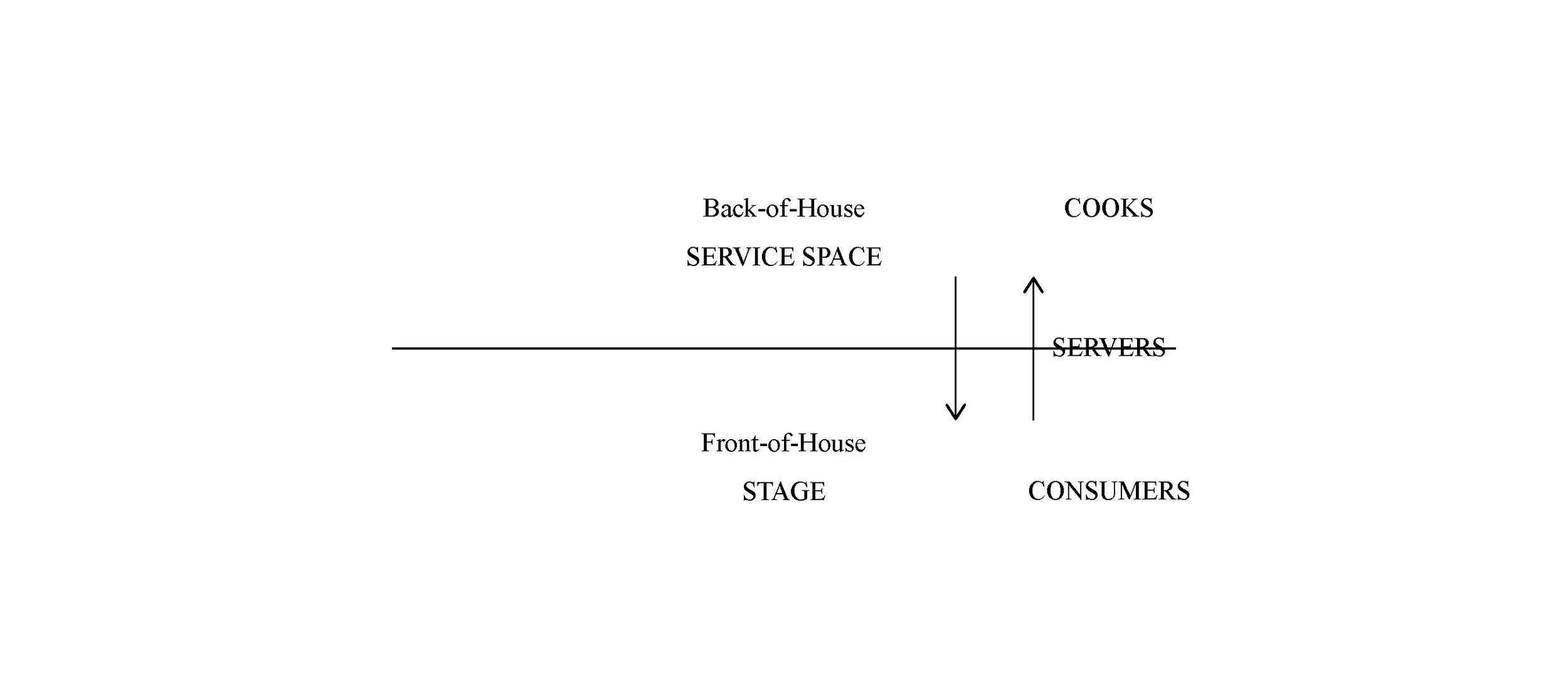
Figure 1: Diagram by the author.
As a programmatic typology, the restaurant separates consumer from cook, concealing labor in the back-of-house. The use of alleys, service doors, and freight elevators further invisibilizes service space, in contrast to the stage as a celebrated site of communal dining. Manhattan Chinatown’s oldest restaurants are a telling case study, where windowless basement kitchens are entirely opaque to the front-of-house, which is serviced by dumbwaiter (see figure 2).

Figure 2: Drawing by the author.
This concealment of service space can be traced back to the domestic buildings of aristocrats. Sociologist Sarah Bowen has stated that “in the past [not all] Americans were cooking their food. They were often relying on low-income women of color to cook a lot of it, and they still are. It’s just that it used to be in the house, and now it’s in restaurants.”(Pressure Cooker: why home cooking won’t solve our problems and what we can do about it. Oxford University Press, 2019. print.) Architect Mabel Wilson’s analysis of Monticello provides evidence of this typological lineage in plantations, where enslaver Thomas Jefferson “deployed the architecture convention of the section to place the spaces where enslaved people worked out of view. His placement of dumbwaiters near his fireplace made the work of Black servants invisible during intimate dinners.”(“Professor Works on Projects at the Intersection of Race and Architecture: Mabel O. Wilson co-designed the Memorial to Enslaved Laborers and co-edited Race and Modern Architecture” Columbia News. 15 October 2020.)
The treatment of hospitality workers and structures of inadequate wages today are descended from this country’s history of enslavement.(“Tipping, The Service Economy, and Anti-Blackness in the Hospitality Industry: A Mini Lecture by Ashtin Berry Feb 13th.” 13 February 2021.) That the design of restaurants reinforces existing social divisions has become more evident in the pandemic; “essential workers’’ continually risk their lives and health without government support while receiving hollow praise for their “heroism.” Elaborate architectural designs for outdoor dining have gone to great lengths to protect the consumer, a paying customer, while neglecting to take safety measures within the back-of-house. Ultimately, these staged precautions are ineffectual because servers are forced to indiscriminately interface with consumers and cooks, likely carrying the virus back and forth, underlining the hollowness of this spectacle (see again figure 1).
Foodways in Chinatown are informed by the neighborhood’s dual identity as a densely-populated and close-knit community, largely of elders dwelling in rent-regulated apartments and dependent on small mom and pop shops, and as a destination for outsiders, both tourists and diasporic Asian Americans. The architecture of Chinatown underscores this divide: the gilded restaurant interiors, highly aestheticized arches, and ornate building facades are designed with tourists in mind.(“Pagodas and Dragon Gates.” 99 Percent Invisible. 08 December 2015.) Meanwhile SROs, single resident occupancy hotels, still house much of the neighborhood’s population. These old buildings are difficult to navigate, according to mutual aid and food justice groups like Moonlynn Tsai and Yin Chang’s Heart of Dinner, which has regularly provided hot meals to Chinatown elders since the start of the pandemic. Design efforts favor the public-facing aesthetic expression of Chinatown, while spaces occupied by longtime residents are comparatively under-served.

Figure 3: Google Street Views curated by the author.

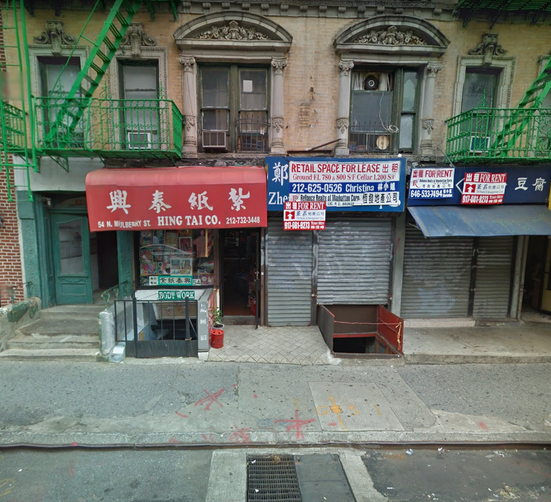
Architects are notoriously preoccupied with authorship and proprietary ownership of creative work, asserting aesthetic authority rather than grappling with the needs of a community. As designer Liz Ogbu stated last July, “the system is working exactly as it was designed, to service the few, to make the process transactional.” Architectural design is taught “as this ‘objective thing’ that ‘gets applied’” rather than acknowledging the individual biases present in every aspect of creative design work.(“What is Community-engaged design during - and after - COVID?” Center for Urban Pedagogy. 22 July 2020.) Though Chinatown’s restaurant kitchens are entirely underground, a hatch on the public sidewalk provides access. Interactions between restaurant cooks and passersby are frequent (see figure 3). This break between back-of-house service space and the front-of-house stage happens in the street, a notably public context, and subverts the typical division. Close observation of informal use of existing spaces by inhabitants offers insights that are crucial for contextually-specific and community-minded spatial designs. Following these indicators, architects can work towards challenging status quo hierarchies and societal inequities rather than reinforcing them.
FURTHER READING
Andrea Mubi Brighenti, Urban Interstices: The Aesthetics and the Politics of the In-between (Routledge, Taylor & Francis, Informa)
Patricio Davila, Diagrams of Power: Visualizing, Mapping, and Performing Resistance (Onomatopee)
Vittoria Di Palma, Intimate Metropolis: Urban Subjects in the Modern City (Routledge, Taylor & Francis, Informa)
Michael Sorkin, Variations on a Theme Park: The New American City and the End of Public Space (Hill and Wang, Macmillan Publishers, Holtzbrinck)

READING CONSTELLATIONS
S.Y. Agnon, Shira (Koren Publishers)
Alison Bechdel, Fun Home (Mariner Books, Houghton Mifflin Harcourt)
Tamara Faith Berger, Queen Solomon (Coach House Books)
Harold Bloom, Book of J (Grove Atlantic)
Roald Dahl, Boy (Puffin, Penguin Random House, Bertelsmann)
Nava EtShalom, Fortunately (Button Poetry)
Franz Kafka, The Complete Stories (Schocken, Penguin Random House, Bertelsmann)
Amos Oz, A Tale of Love and Darkness (Mariner Books, Houghton Mifflin Harcourt)
Marcel Proust, In Search of Lost Time (Modern Library, Penguin Random House, Bertelsmann)
Marjane Satrapi, Persepolis (Pantheon Books, Penguin Random House, Bertelsmann)
Ya’akov Shabtai, Past Perfect (Out of Print, Viking)

Art by @bathroomart101
